YOUR ACTOR WEBSITE SHOULD LOOK PROFESSIONAL.

Build a smart actor website in 90 seconds! Click here to begin.

Your actor website should look professional.

Actor Website sin #-6

Thou shalt not scare thy visitors

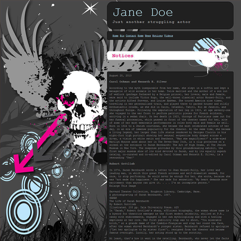
What in the world am I looking at? I'm actually a little scared right now. Did your website just hex me?!!

Your actor website should look professional, yet, I have no clue what in the world I'm looking at here. This "actor website" example features a winged skull with a pink arrow shooting through it's cheek, and there are blue wheeled snow flakes falling into a grass where Mickey Mouse is hiding? The thing is, it's not just a background. It's a theme. Even the heading has a skull on it. Hmm, to be or not to be? Not to be!
The Importance of User Experience: A Guide for Actors

09.20.2024 Achieving On-Screen Success: How to Leverage User Experience for Acting Success
Check it out »

Building a Strong Online Brand: Tips for Actors

09.06.2024 Grow Your Acting Career with an Unforgettable Online Presence: Proven Strategies for Actors
Check it out »

Niche professional websites for people in the film and TV industry.

Weeee, you found me!

I'm your buddy Bottie, I was hiding behind the scenes, but now that you've found me I'd be happy to tell you what I'm doing.

Actor Website helper: Bottie

I just wrote a few fun facts about Web For Actors

Would you like to take a look?
Click here to check them out. I hope it will cause involuntary audible response.