We interrupt this website to bring you a breaking headline. Get it? Headline? Breaking? Ahh, never mind.
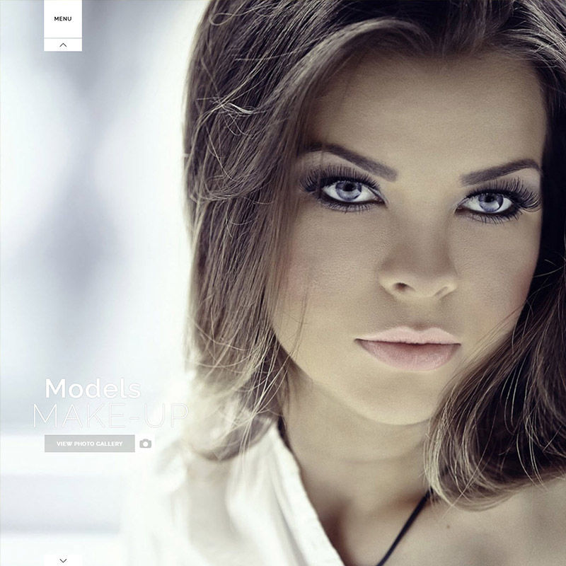
Here's a great example of a good design, nice menu, great photo, but wait, did you see that text over her shoulder? Yes, there's text there. Adding a transparent dark background box to hold your headings might be a way to eliminate these problems.


