FONTS. FONTS. FONTS.

Build a smart actor website in 90 seconds! Click here to begin.

Fonts. Fonts. Fonts.

Actor Website sin #-4

Thou shalt use a font designed within the last 4 score and 7 years

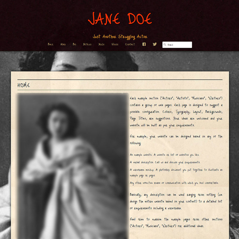
My fair lady, thy website wast clearly not design'd in this century. Thou shalt hire a new e-scribe!

There's absolutely no reason for anyone to pick a funky font for the bio on your actor website. You want funky fonts for logo. Sure. Funky fonts for your headings? Okay, fine, but the second you use a funky font for your navigation or for your bio, you're shooting yourself in the foot.
The Importance of User Experience: A Guide for Actors

09.20.2024 Achieving On-Screen Success: How to Leverage User Experience for Acting Success
Check it out »

Building a Strong Online Brand: Tips for Actors

09.06.2024 Grow Your Acting Career with an Unforgettable Online Presence: Proven Strategies for Actors
Check it out »

Niche professional websites for people in the film and TV industry.

Weeee, you found me!

I'm your buddy Bottie, I was hiding behind the scenes, but now that you've found me I'd be happy to tell you what I'm doing.

Actor Website helper: Bottie

I just wrote a few fun facts about Web For Actors

Would you like to take a look?
Click here to check them out. I hope it will cause involuntary audible response.