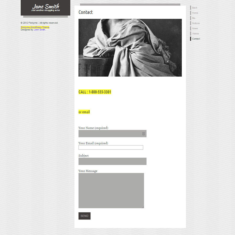
Here's the last example from this particular competitor. The image that is cropped improperly with the head cut off demonstrating that you will be beheaded after you get that website. The sidebar looks empty and makes the page look unbalanced. Uneven contact form fields help make everything unbalanced by alternating in width. Some fields are white, some dark gray. Disabled fields? Can I not contact you? Fine then.


