ADD SOME PERSONALITY TO YOUR ACTOR WEBSITE

Build a smart actor website in 90 seconds! Click here to begin.

Add some personality to your actor website

Actor Website sin #-10

Thou shalt add content to thy website

No shoes, no service. No text, no search engines

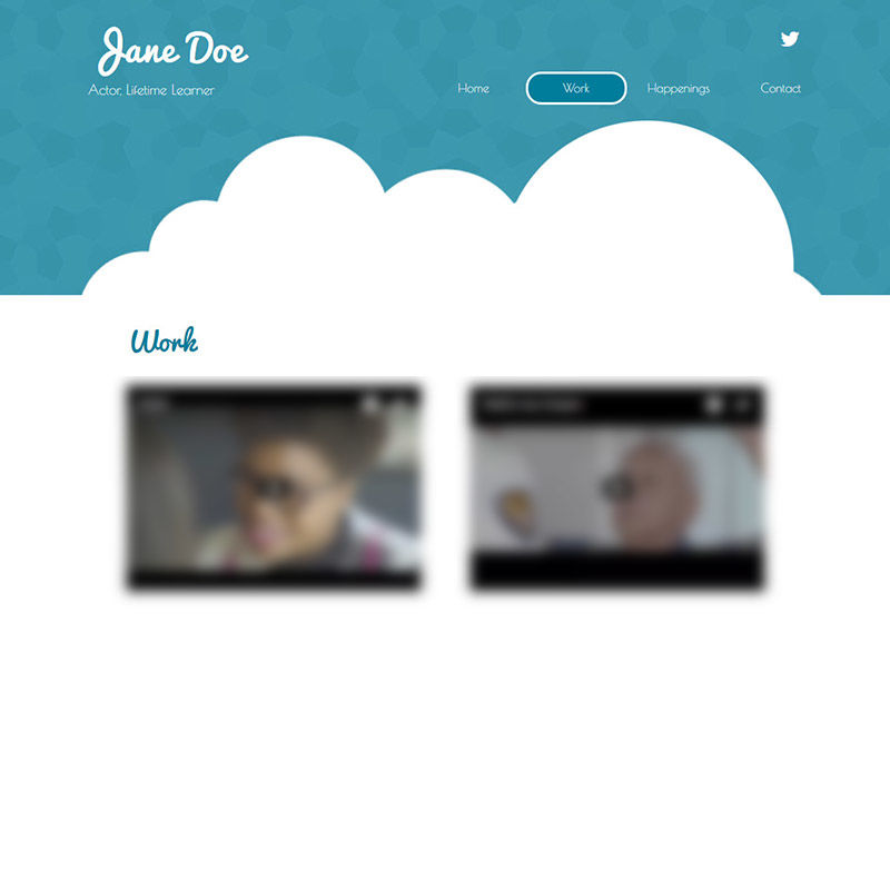
Simple is good, but sometimes you need more than just 2 videos. I actually like the design a bit. Not sure what clouds have to do with acting, but it's cute, and has a good use of colors. The problem is there's just nothing there on this actor website. The lack of keywords and text will render this page unusable by search engines. In other words, search engines will think that this actor webpage is empty. There has to be 20% ratio of text. The other pages on this website are almost as empty.
The Importance of User Experience: A Guide for Actors

09.20.2024 Achieving On-Screen Success: How to Leverage User Experience for Acting Success
Check it out »

Building a Strong Online Brand: Tips for Actors

09.06.2024 Grow Your Acting Career with an Unforgettable Online Presence: Proven Strategies for Actors
Check it out »

Niche professional websites for people in the film and TV industry.

Weeee, you found me!

I'm your buddy Bottie, I was hiding behind the scenes, but now that you've found me I'd be happy to tell you what I'm doing.

Actor Website helper: Bottie

I just wrote a few fun facts about Web For Actors

Would you like to take a look?
Click here to check them out. I hope it will cause involuntary audible response.