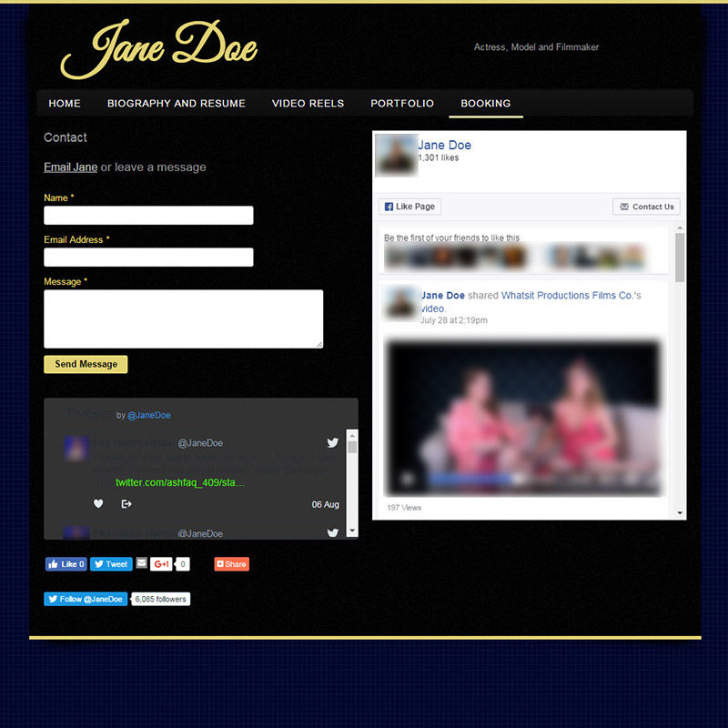
Wow. The only plugin missing here is the big abort button.
I know you want people to find you on your social media, but don't just stick all the plugins on one page and expect everything to look beautiful. This page is louder than an Offspring concert. The Twitter feed is virtually unreadable and the black on blue contrast with bright yellow accents makes it look very...1995. Aren't these the actual colors for Windows 95? I think they are.


